Corporate Design for Small Businesses: More Than Just a Logo
 Created with AI
A logo alone does not make a brand. If you want your small business to be recognised, you need a consistent visual identity that looks the same everywhere: on your website, your invoice, your Instagram post. That is corporate design. This article explains, in plain terms, what it includes, why it pays off especially for small businesses and how to start small and pragmatically. As of July 2026.
Key takeaways
- Corporate design is your company's consistent visual identity, more than just the logo.
- It rests on five building blocks: logo, colours, typography, imagery and a simple layout grid.
- Corporate design (the look) is one part of corporate identity (a brand's whole sense of itself).
- For small businesses it pays off because recognition builds trust and makes you look more professional than your size suggests.
- You do not have to do it all at once. A logo, two colours and one typeface are a solid, affordable start.
What is corporate design?
Corporate design is the consistent visual identity of a company. It defines how your brand looks everywhere: which logo, which colours, which typeface, which visual language. The goal is recognition. When someone sees your website, your business card and your social media and immediately senses that it all belongs together, your corporate design is working.
The difference from the logo matters: the logo is a single element, corporate design is the whole system around it. A logo without defined colours and typefaces is like a face without the rest of the person, recognisable, but incomplete.
What does corporate design include?
Corporate design consists of a few clearly defined building blocks. Five of them form the foundation.
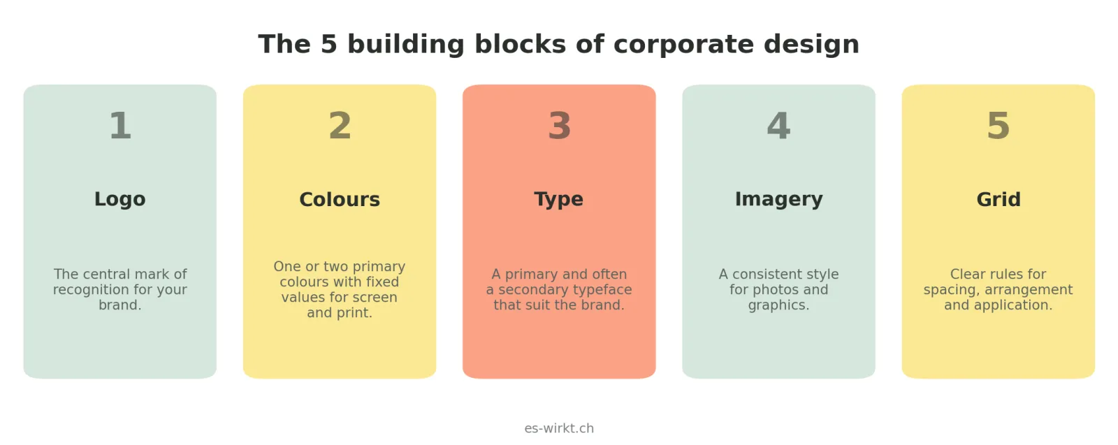
First the logo, the central mark of recognition. Second the colours, usually one or two primary colours plus a few supporting tones, always with fixed colour values for screen and print. Third the typography, that is a primary and often a secondary typeface that suit your brand. Fourth the imagery, a consistent style for photos and graphics so that not every image looks different. And fifth a simple layout grid, that is rules for spacing, arrangement and application so everything looks tidy and consistent.
 Created with AI
For a small business these five blocks do not have to be complicated. What matters is that they are defined and used consistently. A single page that captures logo, colours and typefaces is already enough as a foundation.
Corporate design or corporate identity?
These two terms are often confused. Corporate identity is a brand's whole sense of itself, not just how it looks, but also how it communicates, how it behaves and what it stands for. Corporate design is the visible part of that, the appearance.
Put simply: corporate identity is the character, corporate design is the way it presents itself. For most small businesses the journey starts very practically with design, because a consistent appearance is the first visible step towards a clear brand.
Why corporate design pays off for small businesses
For large companies a consistent appearance is a given. For small businesses it is a real advantage, precisely because so many neglect it. Three reasons make the case.
First, recognition: someone who meets you several times in the same visual language remembers you. Repetition builds trust, and trust leads to enquiries. Second, professionalism: a consistent appearance lets even a one-person business look serious and reliable, often bigger than it is. Third, efficiency: once colours, typefaces and templates are set, every new invoice, flyer and post gets done faster, because you are not deciding from scratch each time.
Precisely because budgets at small businesses are limited, a well-considered corporate design acts like a lever: set up cleanly once, it pays into your external image for years.
How to start as a small business
You do not have to begin with a hundred-page brand manual. A pragmatic start that grows with you makes more sense.
At the beginning stand the three most important blocks: a well-considered logo, one or two primary colours with fixed values and a suitable typeface. That already covers most applications. In a second step you add consistent imagery and a few templates, for invoices, social media or presentations. And as your presence grows, you capture it all on a few pages, so that others too, an agency or a new employee, apply your brand correctly.
The most important principle: better to use a few elements consistently than many half-heartedly. Corporate design ultimately flows into almost everything, including your website, which is why it is worth getting it right early.
Corporate design in practice: two examples
It becomes most tangible with small examples. Picture a neighbourhood café: the same warm red and the same handwritten typeface on the sign, the menu, the coffee cup and the Instagram post. You recognise the café instantly, wherever you meet it. That is corporate design in daily life, not one pretty element, but the thread running through everything.
Or a trades business: a clear logo on the company van, the same colour on the workwear, the invoice and the website, plus photos in a consistent style rather than a jumble of phone snapshots. It does not cost large sums, yet it immediately looks reliable and tidy. The difference between a small business that looks professional and one that looks improvised rarely comes down to budget, but to this consistency.
What does corporate design cost?
That depends heavily on scope. A single logo is cheaper than a complete identity with imagery and templates, and much can be built step by step. More important than a flat figure is that you know what you get and that the basics, logo, colours and typeface, are cleanly defined. An honest quote lays that out up front. What we include and what it costs is on our pages for logo and graphic design and brand identity. If you are unsure where to start, just ask and we will look at it together.
Conclusion
In short: Corporate design is more than a logo, it is the consistent appearance made of logo, colours, typography, imagery and a few clear layout rules. For small businesses especially it pays off, because recognition builds trust, makes you look more professional and saves time day to day. You do not have to do it all at once: a good logo, two colours and a suitable typeface are a strong, affordable start that grows with you.
Frequently Asked Questions
What is corporate design in simple terms?
Corporate design is a company's consistent visual identity: logo, colours, typography, imagery and a few layout rules. It ensures your brand looks the same everywhere and is recognised.
What does corporate design include?
Five building blocks form the foundation: the logo, the colours (with fixed values for screen and print), the typography, a consistent imagery style and a simple layout grid for spacing and application.
What is the difference between corporate design and corporate identity?
Corporate identity is a brand's whole sense of itself, that is appearance, communication and behaviour. Corporate design is the visible part, the appearance. Put simply: corporate identity is the character, corporate design the way it presents itself.
Is corporate design worth it for a small business?
Yes. A consistent appearance builds recognition and trust, makes you look more professional and saves time day to day, because colours, typefaces and templates are set. You can start small and let it grow.
About the author: Sabine is part of es-wirkt, an advertising agency in eastern Switzerland. She writes about brand, design and digital marketing for small businesses, and helps companies get recognised with a consistent appearance.